
Classic Chrome vs. Classic Neg: Which Fujifilm Simulation to Use
Understand the difference between Classic Chrome and Classic Neg, then choose the starting point that better supports your subject, light and intended mood.
 Receptree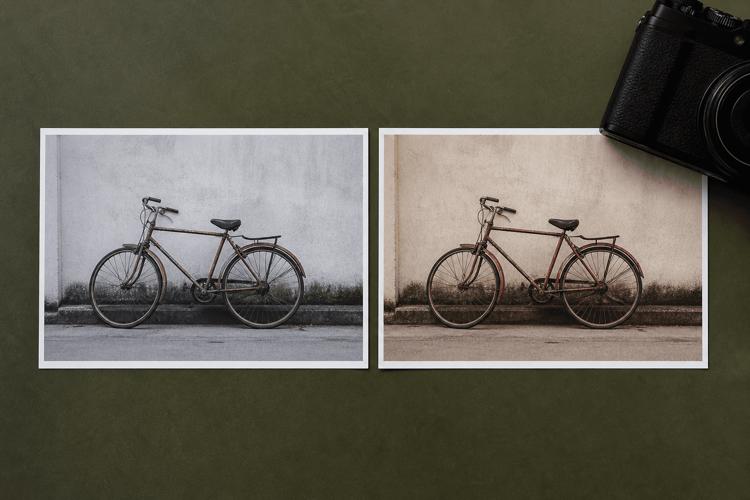
Applies to: Written for Fujifilm photographers. Camera menu names, film simulations and available settings vary by model and firmware.
Classic Chrome keeps the subject in front
Classic Chrome uses restrained colour, moderate contrast and a quieter treatment of warm tones. It is often a helpful choice when a scene already has visual energy and you want the camera rendering to stay measured. Street, documentary, travel and overcast scenes can benefit from that calmer baseline, especially when you want the subject or structure of the frame to do most of the work.
Classic Neg brings more density and colour tension
Classic Neg has deeper shadows, a more pronounced colour response and a stronger sense of contrast. It can suit environmental portraits, warm ambient scenes and photographs where you want the JPEG to feel more finished straight out of camera. In already hard light or a high-contrast scene, it can become heavy quickly, so protect important highlights and make a reference frame before committing to it.
Choose for the scene, not a permanent identity
Classic Chrome is not automatically more serious, and Classic Neg is not automatically more cinematic. A quiet overcast street, a family table under warm lamps and a graphic midday facade all ask different things of the JPEG. Let the subject and light decide where to begin. If colour or shadow treatment begins to call more attention to itself than the photograph, move to the quieter option or reduce the supporting recipe adjustments.
Compare the practical differences
Neither simulation is universally better. Think of them as two different responses to the same scene.
- Contrast: Classic Chrome stays moderate; Classic Neg gives shadows more weight.
- Colour: Classic Chrome is restrained and documentary; Classic Neg is warmer and more expressive.
- Best starting conditions: Classic Chrome is flexible in mixed or harsh light; Classic Neg often shines in directional or warm light.
- Availability: Classic Neg is not present on every older Fujifilm camera, so confirm the recipe is compatible with your body.
Use the same comparison method for both
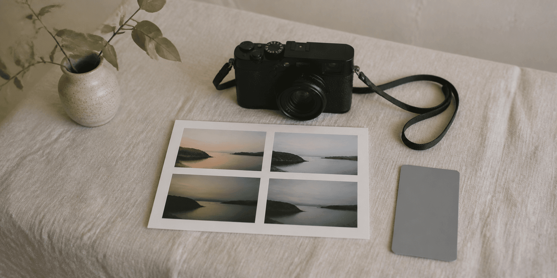
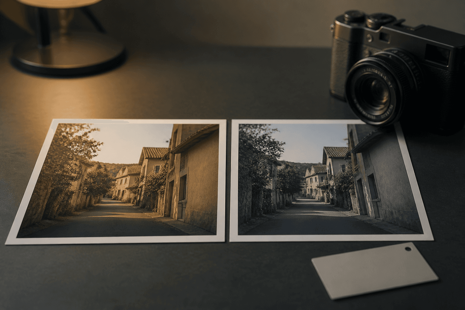
Save two otherwise comparable recipes, then photograph the same subject in the same light. Do not make one version cooler, brighter or sharper at the same time; that only tests the extra changes. Make a wider frame, a closer frame and one frame with a highlight or shadow that matters. On a larger screen, compare the images in pairs and ask a simple question: which version helps the subject feel more like the picture you wanted to make?
- Keep the same exposure intention for both simulations.
- Compare skin, neutrals and bright areas only when they are relevant to the subject.
- Repeat the test in a second kind of light before making one your default.
Test them in the same light
Set up two comparable recipes and photograph the same familiar scene with both. Keep exposure intention consistent, then compare the keepers rather than judging from a camera screen alone. Look at skin, bright areas, shadow detail and the overall mood. After a few outings, choose the version that repeatedly supports the photographs you actually want to make—not the one that only looks striking in a single sample.
Classic Chrome and Classic Neg. recipes
Compare two complete community recipes from each simulation, then inspect how the surrounding settings reinforce the base look.

Really like how this recipe makes photos feel, bright and slightly overexposed, like an old Kodak color negative. Reds and yellows pop, giving sunlit scenes a soft, nostalgic vibe. Feels cinematic and a bit like classic film photography.
 Receptree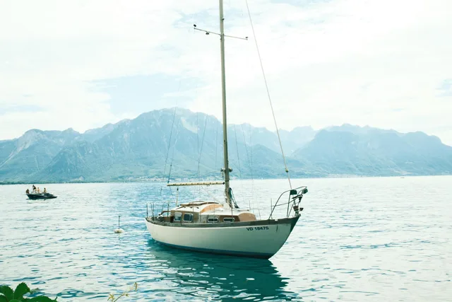
This recipe turned out great I think. The colors are gentle but still vibrant, with soft pastel greens and just the right touch of saturation. Gives a bit of a nostalgic, cinematic vibe while keeping everything feeli
Receptree
Really like how this recipe turns out, warm, sunlit tones with soft highlights and gentle shadows. Colors stay vibrant but clean, giving a nostalgic summer glow with a simple, cinematic feel, no grain.
Receptree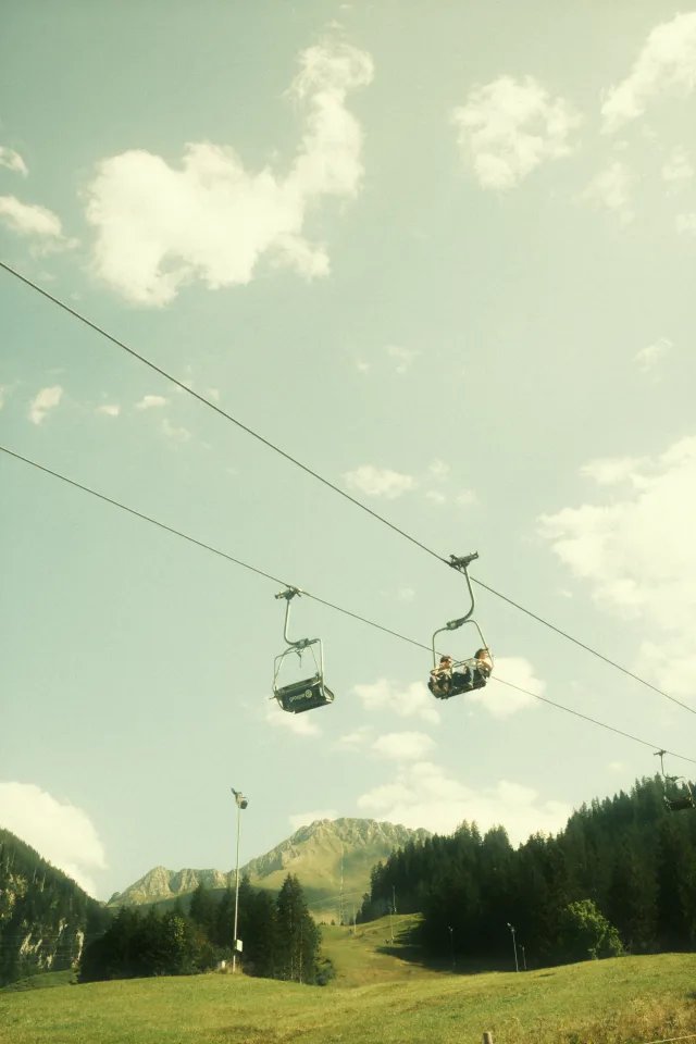
A warm, nostalgic look inspired by classic color negative film. Perfect for capturing everyday moments with a soft, vintage vibe and subtle color shifts. Works beautifully in golden hour light or for giving ordinary scenes a timeless feel.
 Marc
Marc